The exhibition, opened at the gallery Arto.to at Uhelný mlýn, is named after the novel by Jun’ichirō Tanizaki Some Prefer Nettles, or, more specifically, by the translation of the novel in Czech (Ti, kteří raději kopřivy), which was published in 1965. But no matter the language, it’s the Tanizaki’s text that is the overall theme and the main character here.
I haven’t read the novel (I am not a very educated person), but I know the plot. Divorce and approved adultery, roles that people are forced to play, new Western elements versus genuine Japanese, the future and the past, escape from reality (into the imaginary East as well as to the West), erotic desires and bunraku puppet theatre («Puppets are better than people» theme, including reflections on Japanese society)… All that Wikipedia kindly offers to us.
Some Prefer Nettles is the part of gallery’s exhibition plan for this year, which is titled Traces of Place. The theme reflects the influence of the external environment on individual’s life, the interweaving and layering of lived experiences, and their further transformation over time (my favourite topics, on which I wrote a lot of texts, none of them in English). The environment in which people live directly affects and influences them, whether it is a conscious or unconscious influence (where «unconscious» is my personal No.1 way of forming a personality, I have to admit). And there will be three exhibitions with three independent curators in 2025 (Some Prefer Nettles was organised by Vendula Fremlová), each somehow incorporating the theme of the influence of place.
The exhibition features works by Marie Filippovová, Eva Sakuma, Lada Semecká and Moemi Yamamoto. Each has its own connections and relationships with Japan and Japanese aesthetics.
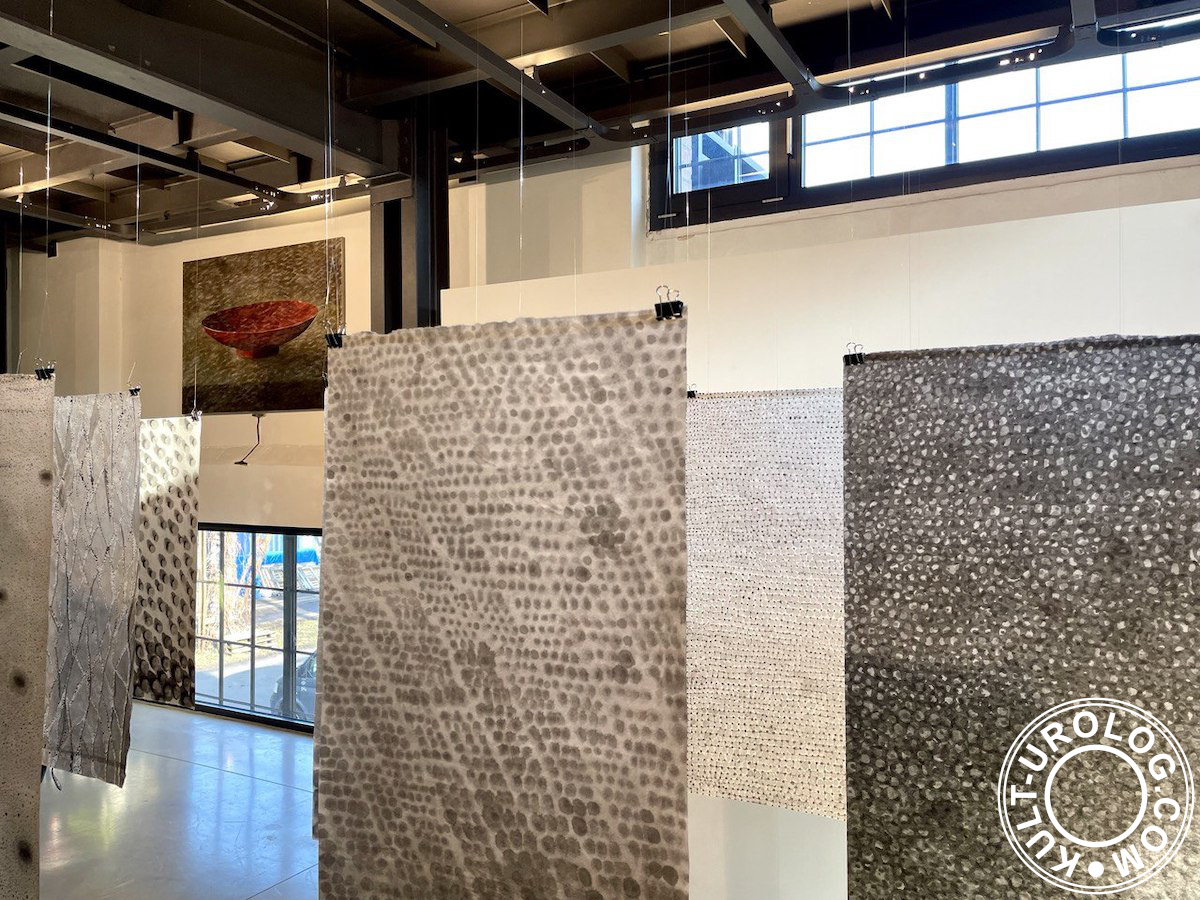
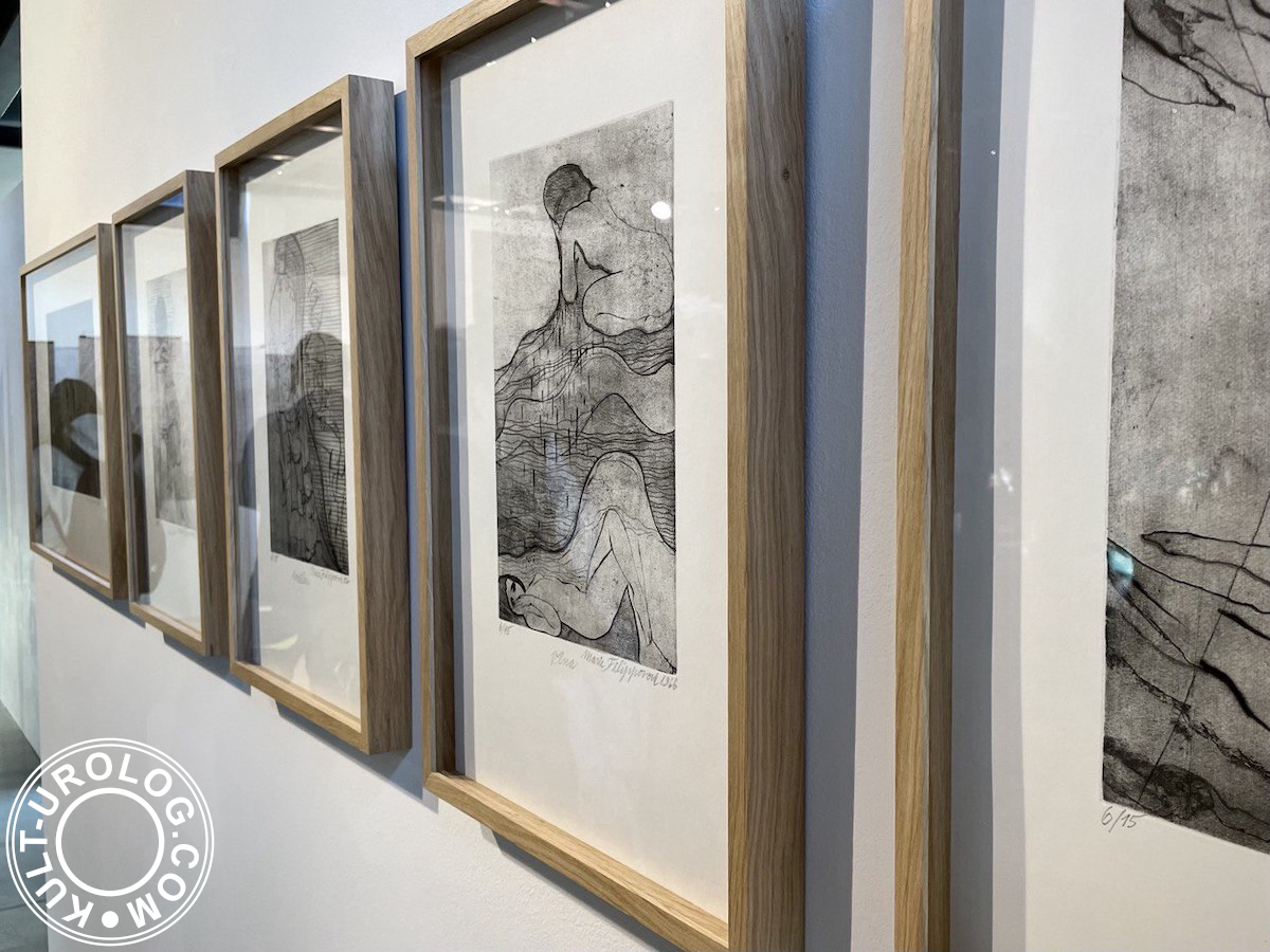
The graphics from the series Some Prefer Nettles by Filippovová, created a year later after the Czech translation of the novel was published, are the core of the exhibition. They are complemented by drawings under a title Dreams and Reality (Sny a Skutečnost, 2001–2024).
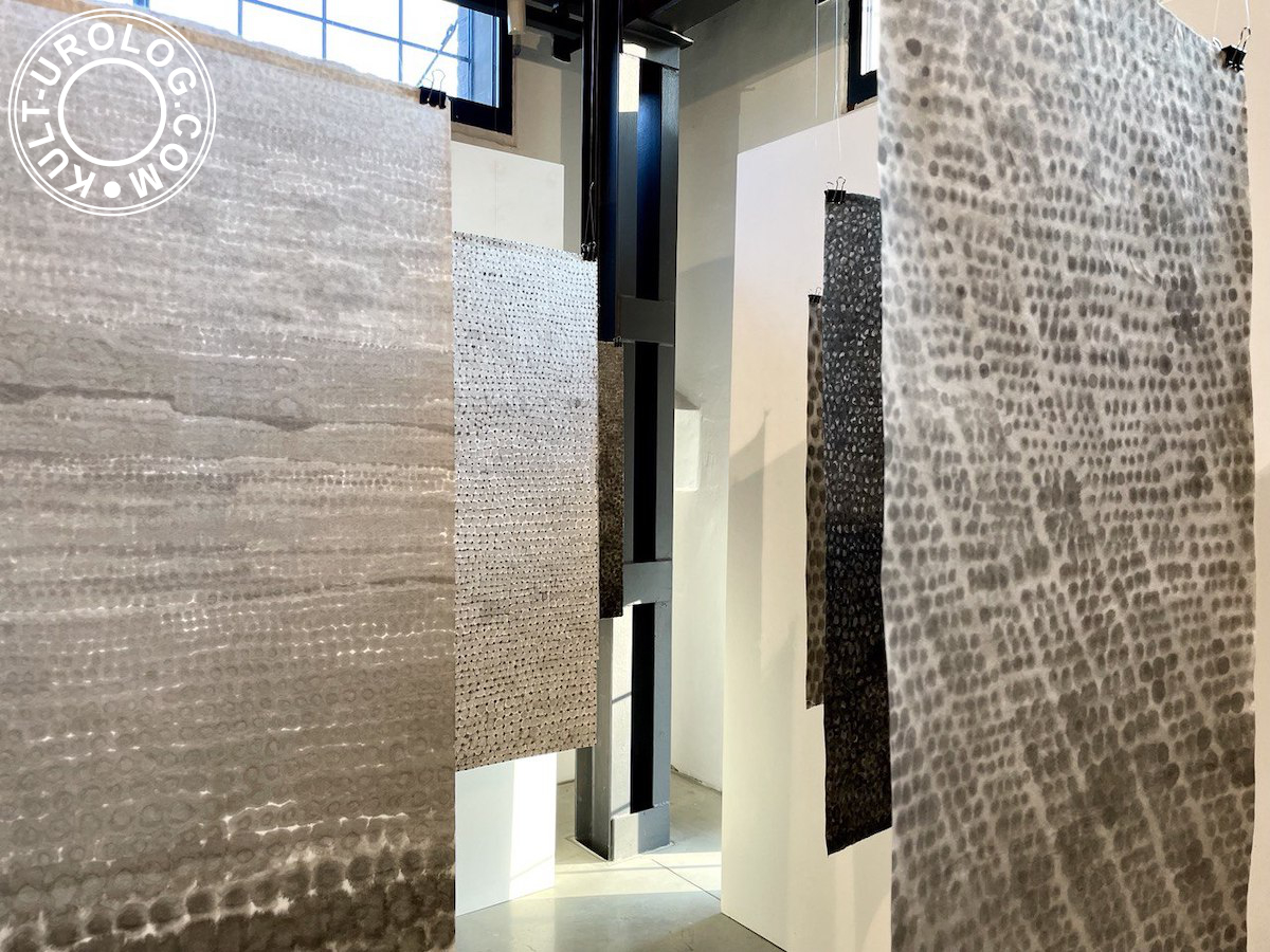
Wide stripes of paper, hanging like canvases, drying or dividing space, were all about shades of ink and precious paper (like the one, that Sei Shōnagon so loved to praise in The Pillow Book), with sunlight penetrating through the smallest punctures.
It reminded me of the old anime series about Sherlock Hound: some letters in the note were punctured, so they formed the encrypted word, which became evident because of the ray of light of camera obscura. So, I honestly wanted to think, there was something encrypted in the drawing too, thanks to the jokes of my memory (did I already mention, I am not a very educated person? well, that was the example).
The core is accompanied by works of three other artists.
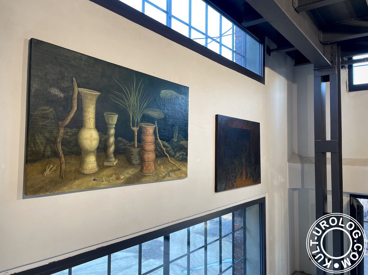
The fact that we were at the opening of the exhibition means that there were paintings by Eva Sakuma, three new ones and three from her solo exhibition a few months ago.
I have already written about Forgotten Preciosness separately, discussing spaces and layers, and since nothing has changed radically in my perception of Eva’s art so far, now, to make the picture a little more complete, I will simply add that Japan for her is not just a favourite plot, but a second home and part of a family life.
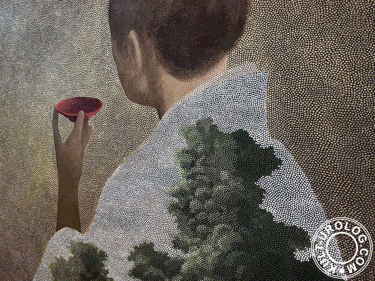
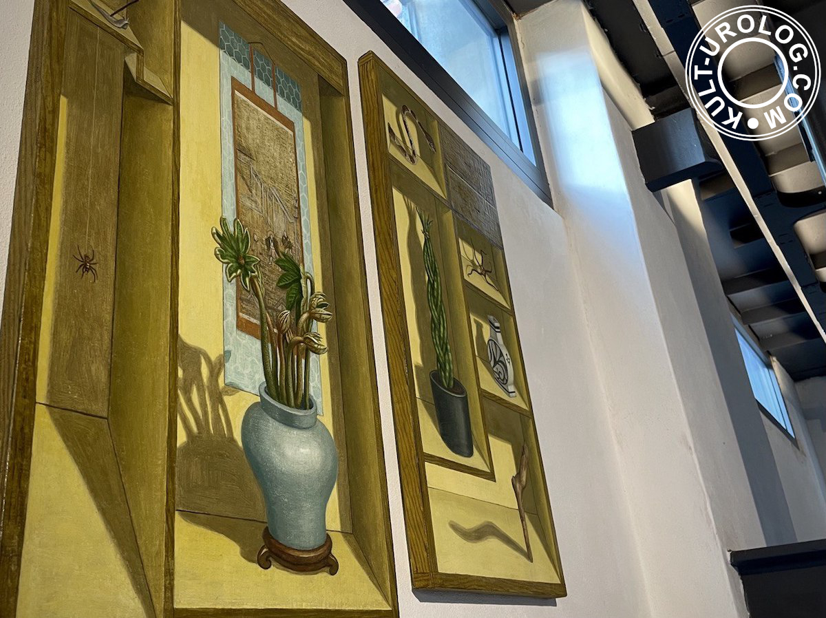
Moemi Yamamoto lives and works in the Czech Republic, where (quoting the exhibition’s official description) she recently completed her painting studies at the Academy of Fine Arts, and where she creates paintings combining Japanese motifs with references to Renaissance European painting and the current reflection of surrealism in art.
So even for the newcomers it was evident who is the author of trompe-l’œil cabinets of curiosities with Japanese wooden toys and braided senseverias (it’s practically about nettles), so familiar thanks to Max Ernst, Van Hoogstraten or Yasujirō Ozu (or Yoji Yamada, they both show a wide range of Japanese interiors in their films).
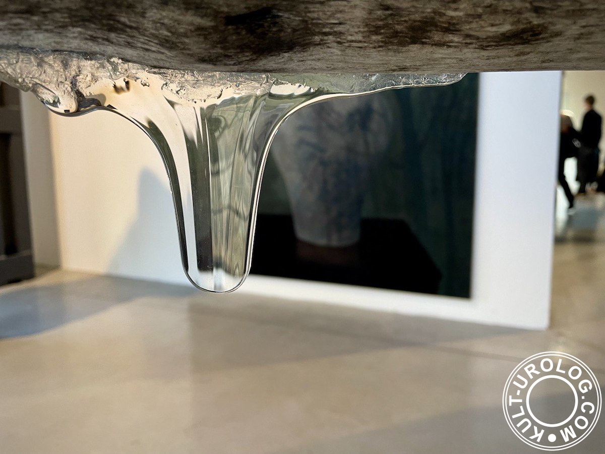
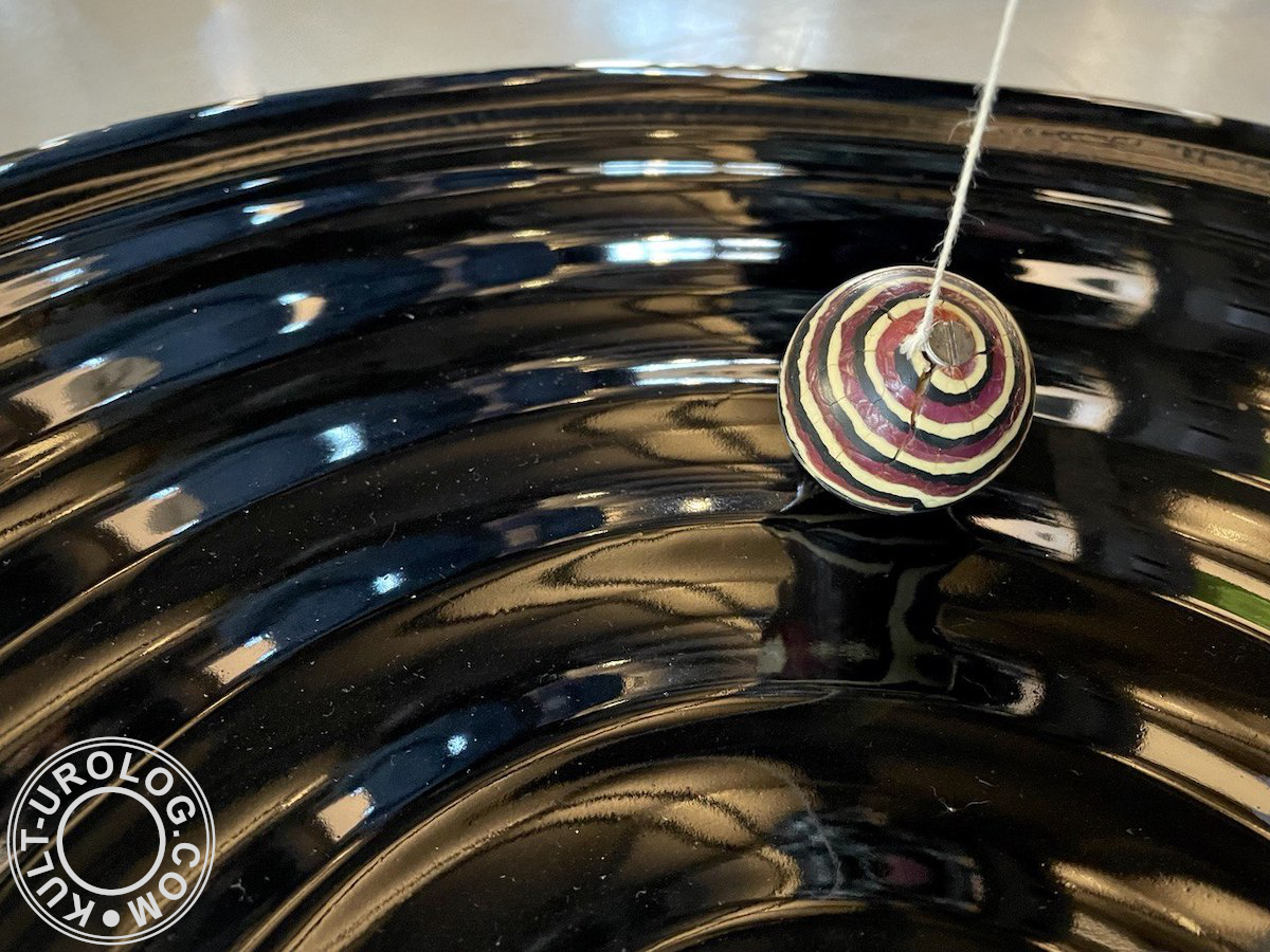
Lada Semecká, who (quoting the description again) moved to Japan for several years, when she taught glass at an art school in the city of Toyama, was the author of the most interactive part of the exhibition. There were two glass disks on the floor, black and white, like Go stones, reflecting light, moving like a potter’s wheel under Foucault pendulum. Children played with them. Another object was a piece of wood through which «oozed» glass. A game with contrasting textures and materials for grown-ups, whose task was not to drop the entire structure.
Of course, familiar topics were mentioned, such as the Western and the Japanese, and the relationship between cultures (Japonisme in particular).
And here we could start to discuss the influence of Dutch art on Hokusai, the alternation of periods of isolation and globalization of Japan, or continental influence (with a long history of complicated relationships between «own» and «foreign» in Japanese culture), all that gave Europeans the joy of recognition and admiration of the familiar-unfamiliar… But we won’t do this.
We will stick instead to the europeans’ desire to buy up woodblock prints and vases (in some sort familiar to Chinese and Korean so-called colonial goods, but such topics in the late 19th century did not interest anyone, especially in Britain or, say, in France), impressionism, the discovery of a new source of inspiration and imitation (it doesn’t matter what Japan did without us, what’s more important is how (hooow?) we managed to live without Japan before), and all the other little things once called Japonisme.
It will be enough. Because, yes, we can dig deep, but we still won’t be able to dig up anything new within the limited space of a text about the exhibition.
My level of expertise allows me to mumble something about In Praise of Shadows or The Makioka Sisters, but since it’s not the case for our subject, and usually I feel uncomfortable talking about things I don’t know well, I will talk about the book as an object (a part of the material world), and not about the book (novel) by Tanizaki. Because, as for books, I know a lot about them.
So let’s explore the topic from the perspective of Japanese book art (a handwritten book art, to be more specific), because everything here is a book (full of illustrations, and only a little text is left).
Handwritten type of book was widespread before the Edo period in ritualised spaces (mostly temples and monasteries, sometimes palaces) and its perception was based on prior knowledge of the text (and, of course, it continued to exist during the Edo period as well, being addressed also to a limited circle of readers, but after 17th century such books changed a little, becoming, for example, guides to ikebana, marked «Do not show to disciples of other schools!»).
The complete data, with all possible sutras and Chinese poems, laid outside the text. Just like the Tanizaki’s novel, no matter in which translation, was outside the exhibition. For a deeper understanding of the text and for the self-organisation of the perceiving person, in the name of allusions and associations, contemplation of the whole page was more important than working with words only. In our case, it is assumed that we have heard something about Nettles (but not necessarily read it, though we had to, at least in the ideal world…), so this comparison looks more or less relevant (it’s Lotman, by the way, talking about art as an information paradox in an article that was published many years ago).
So, everything is important. Namely: the color and texture of the paper (both decorations and inclusions), colours of its illustrations and the cover (case), the finish, the smell (if you read about the manufacturing technology, the recipe was not completely odourless) and the shades of the ink, the rhythm of the writing, the line of the drawing, composition and balance of all elements… With all of it book became a work of art.
As for illustrations, the verbal image in old Japanese books wasn’t simply translated into an image on paper, instead, graphics parallel to the text were created. In this form, the book was perceived as a whole (not just a sum of elements). Besides the experience of reading was always the experience of communication with a specific object, i.e. the literary text had a multi-layered structure, being read at different levels of perception.
Of no less importance was the setting in which readers interacted with the book. In our case, in natural light. It is, as we remember, alive, as opposed to Western, artificial. Which is very much in Tanizaki’s style.
Just like a Japanese book, the exposition is full of air, full of empty space, and has an asymmetrical composition. Primary colours: green, brown, grey, black, white, and transparent. All rolled and packed into the gallery building. Exposed brick, sleepers and rails, factory chimney outside; a cramped space, narrow stairs, piles of boxes, black frames and square glass — all of it gives us the right associations. Gallery’s building is a former factory, converted into an art space not long ago. The result that demonstrates us, that industrialisation was not so necessary in some cases, and the nature (or the art, or the life… pick your own option) sooner or later will took it all back.
Uhelný mlýn is located outside the city, so all the way to the gallery (twenty minutes from Prague by train from Holešovice Station, along the Vltava, with a view of the river and hills) you have a chance to see a lot of industrial architecture, including workers’ dormitories. This helps to soak up the atmosphere: Nettles was published in 1929, when similar industrial architecture had already changed the Japanese landscape beyond recognition. That was one of the most visible parts of a disturbing shift back then. Now it’s a perfect accompaniment.
Bright sun gives contrasting shadows and spots of light. And I guess, in the twilight or at dawn the exposition should look way more interesting. Not because of some sorts of poetry or other philosophical stuff, just because there is no one else in the room, and there is more air and less noise. After all, a lot depends on the environment in which you interact with the book (for example, interacting with the exhibition after the opening or in the room still full of guests could give you two different sorts of experience and of a text).
As for the perfect reader of this book, I would choose Kusumoto Ine. Just like she is shown on the most famous picture in an oval frame, with a book in her hand (most likely with a Western, scientific one). First of all, because pictures are better than people. Just like bunraku puppets, they don’t mind. Second, she is too cool not to mention her, because the exhibition was opened on 8 March (and it will last till 31 May), which gives us an excellent combination, with no need to figure out how else to end this text.
